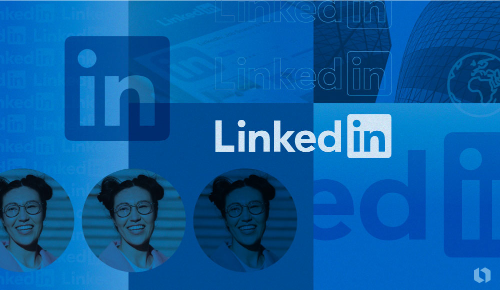
From Pixels to Professionalism
By Nisha Jun 7, 2024
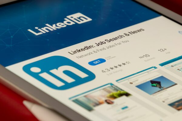
Since its launch in 2003, LinkedIn has become the world’s largest social media platform for professional networking and career development.
The evolution of the LinkedIn logo mirrors the platform’s strategic growth over time. From its inaugural appearance in black, white, and blue to the crisp, contemporary emblem we recognize today, each iteration reflects the company’s growth and the evolving landscape of professional networking.
Follow along to learn about the history of this tech giant’s logo design. And read about more iconic logos here!
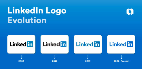
LinkedIn logo evolution summary
- Linking in (2003-2011): The original logo paired “Linked” in black lettering with “in” in white inside a solid blue square.
- A shift in typeface (2011-2019): A 2011 redesign refined the typeface.
- Refreshed palette (2019-2021): The logo dropped black for blue across the board.
- Deeper blue (2021 – Today): Designers made subtle changes as part of a broader brand refresh to simplify and improve user experience.
A brief history of LinkedIn: From a co-founder’s living room to a world leader
LinkedIn has made strides since it was conceptualized in co-founder Reid Hoffman’s living room in December 2002. Hoffman, Allen Blue, Konstantin Guericke, Eric Ly and Jean-Luc Vaillant launched the platform in May 2003. It quickly gained traction, boasting 4,500 members after its first month. The introduction of “LinkedIn Jobs” in August 2004 marked a significant development, furthering the platform’s influence in professional networking.
Going public in May 2011, LinkedIn’s IPO was a landmark event. Its IPO established its market value and solidified its status in the social networking realm. The platform’s evolution continued with new features like endorsements and LinkedIn Learning, expanding its opportunities for professional growth.
The acquisition by Microsoft in June 2016 for $26.2 billion was a testament to LinkedIn’s significance in the tech and professional sectors. Today, LinkedIn is a global network with over 1 billion members in over 200 countries and territories and serves as a central hub for professional connections and career progression.
The LinkedIn logo evolution
A social network’s logo is crucial for instant brand recognition, trust-building, and a memorable user experience. It sets the tone for the platform’s identity, fosters differentiation in a competitive landscape, and serves as a central element in marketing efforts.
LinkedIn’s logo adapts seamlessly across platforms due to its simplicity, professionalism, and versatility. The “in” symbol ensures instant recognition. The logo’s positive associations, timelessness, scalability, and global appeal further enhance its overall effectiveness in representing the LinkedIn brand.
2003-2011: Linking in
The original LinkedIn logo featured black text for “Linked” and a blue box with rounded corners holding the white “in.” This design emphasized the play on words of being “linked in” a professional network.
2011-2019: A shift in typeface
The 2011 redesign adopted a slightly thinner typeface and slightly deeper blue shade. The composition, and concept remained the same.
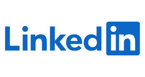
2019-2021: Refreshed palette
The designers gave the logo a simpler, cleaner look by changing the black “Linked” to the same shade of blue as the box. This unified color scheme symbolized a more cohesive and mature brand identity.
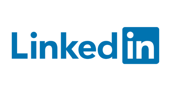
2021 – Today: Deeper blue
The current LinkedIn emblem maintains the 2019 design’s simplicity with a more vivid shade of blue. Notice a similarity in tone to the Facebook logo? This blue reinforces the brand’s commitment to being a trusted platform for professional networking. The consistent design reflects stability and reliability in the brand’s identity.
Tip: Royal blue is a trending color for logos in 2024!
Big themes: LinkedIn logo design elements
As with other social media platforms’ symbols, the LinkedIn logo serves as a visual representation of the company’s personality, values, and mission. It provides a quick and effective way for customers to identify and connect with the brand.
The significance of the ‘in’ icon
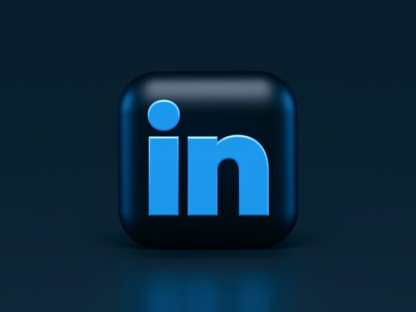
The LinkedIn “in” monogram, a stylized “in” inside a square, is not just a clever play on words suggesting users are ‘linked in’ to a professional network; it also serves as a visual shorthand for the brand.
This emblem is instantly recognizable and can be used independently of the full LinkedIn logo, making it ideal for smaller spaces or as an app icon.
Font and typography in focus
The LinkedIn logo’s clear, sans-serif typeface is easy to read and visually appealing, which is critical for a platform that prioritizes professional networking and career development. The consistent spacing and alignment of the letters in the logo create a balanced and harmonious look across various applications and sizes.
The boldness of the font signifies strength and stability, reassuring users of the platform’s reliability.
The color story behind LinkedIn’s visual identity
The simple three-color palette of LinkedIn blue, black, and white enhances the LinkedIn logo’s impact and clarity, especially against a white backdrop. This color combination of elements makes it one of the recognizable icons in the digital world.
The choice of colors is intentional. LinkedIn Blue, the brand’s primary color, symbolizes trust, reliability, and communication. The black and white elements provide contrast and readability, ensuring the logo remains accessible and visually appealing on the web in various sizes and formats.