Logo shapes help set the tone for your business beyond just their aesthetic appeal.
Research on visual communications shows that specific shapes hold associations in the human brain.
This means that adding a deliberate shape to your logo design won’t just change how it looks — it’ll change how your audience understands and perceives it.
Logo shapes matter. And when layered with colors, fonts, and imagery, an effective logo they can take on even stronger meaning.
Below, we’ll explore familiar shapes and their impact on consumers. We’ll also cover how to choose the right logo shape along with examples for each kind.
Let’s jump in!
- Circle logos
- Rectangle and square logos
- Triangle logos
- Vertical and horizontal logos
- Organic and spiral logo shapes
- Abstract logo shapes
The psychology of shapes
Understanding the psychology of shapes gives you the upper hand when designing a logo. By working with the subconscious meaning behind each shape, you’ll better communicate your brand and set the right foundation for your logo.
Here’s a crash course on the attributes associated with basic shapes:
- Circular shapes: Unity, community, friendship, stability, feminine
- Triangular shapes: Masculine, power, law, science
- Square shapes: Strength, efficiency, professionalism, practicality
- Vertical lines: Aggression, masculinity, strength, progress
- Horizontal lines: Calm, tranquility, community, speed
The meaning of your logo shape can be drastically influenced by color and emotion. Shapes can take on a new meaning when introduced to a color with an opposing association, so choose a color palette that aligns with your intention.
How to choose the perfect logo shape
1. Choose the values you want your logo shape to represent
List your business’s values and use them to guide you in choosing the right logo shapes that highlight those attributes. Your values will also be the pillars of your brand personality, so take the time to survey your customers to get it right from the start.
2. Use a color palette that compliments your brand values
Colors can trigger different emotions. So, complementing your logo shape with the right color combinations can either boost your logos appeal or steer it in a different direction. Use color deliberately!
3. Consider your competition
Take a look at your competitors’ logo shapes and make a note of the most used shapes and colors. Although your logo shape and color palette should be rooted in your brand personality, try to differentiate yourself with shape and color while staying true to your vision and industry.
If you don’t know where to start, play with different shapes in our logo maker and see what looks best for your brand!
Logo shapes and their meanings
Let’s get into some powerful logo shapes and their respective meanings. We’ll cover iconic logo design along the way to help you gather logo shape ideas, and choose shapes that convey specific emotions.
1. Circle logos
An absence of edges or points makes circle logo design a popular choice. Circles are round and soft and, thus, inherently different from most other shapes. Circles are associated with security, continuity, and protection.
Oval logos are also included in this category, along with multiple circles in combination with one another.
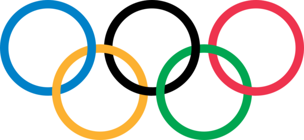
Multiple circles are often representative of community, love, and support, as well as infinity and continuity. An iconic example of this would be the Olympic logo, with its overlapping rings.
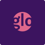
The Glo logo below, created with our logo generator, uses negative space in the pink circle to spell out the company name and evoke a mysterious, feminine feeling.
A good example of a famous circular logo is Nivea. The white wordmark in a dark blue circle is reminiscent of the brand’s classic tins of body lotion. The logo is instantly recognizable on packaging and ads.
Here are some more examples of circle logo design shapes:
2. Rectangle and square logos
Squares and rectangles translate to feelings of stability and balance in the human mind. As such, secondary psychological associations of reliability and stability often occur. Using 90-degree angles means square logos are inherently “edgy”(double meaning intended). Squares can be used to create structure and solidity in a logo. That said, square shapes might be less noticeable due to their common portrayal on square or rectangular mediums like books, magazines, computer screens, and TVs!
Click here to read more about square logos!
Ritter Sport is a classic example of a square logo. To echo the shape of the company’s chocolate bars, they use a square container in the logo, putting it into a nice, neat package.
3. Triangle logos
Triangles are a dynamic and less common logo shape. Triangles are associated with stability and ingenuity, as mysticism and the arts.
The harsh lines and dramatic geometry of triangles can make for some very playful logos. The power of the triangle shape is that it can be positioned differently depending on the effect you’re trying to have.
Place a triangle with the tip pointing upward for a more grounded, stabilizing logo. Rotate the point downward for a more active logo communicating movement and motion. You can also use triangles in logos to substitute for the letters ‘A’ and ‘V.’Click here to read more about triangle logos!
Click here to read more about triangle logos!
Looking at the Adidas logo design below, the slanted lines form an abstract triangle that evokes motion and speed, which ties nicely into its brand identity, brand recognition, and product offerings.
4. Vertical and horizontal logo shapes
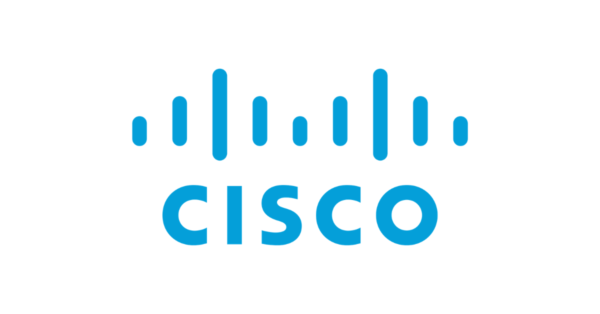
Here’s some logo psychology 101: the orientation of shapes can change how we perceive a logo. Vertical lines and shapes are associated with strength, courage, dominance, and progress. They’re often formed as a dynamic way to guide the eye in a particular direction.
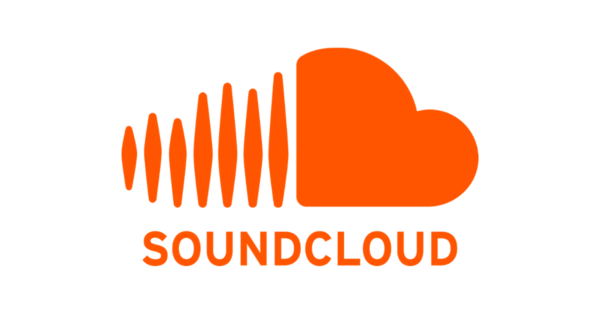
See the SoundCloud logo and Cisco logo below for a perfect example of that!
A sequence of vertical lines may also fool the eye into thinking a shape is narrower than it is, while horizontal orientations make images appear wider. Horizontal lines are associated with calm, community, and speed.
IBM uses horizontal lines to communicate speed and trust within its logo.
Spotify, a music-listening app, uses horizontal lines within its logo symbol to communicate speed and connectivity.
Bumble, a women-led relationship-building app, uses horizontal lines within a hive-shaped icon to convey a sense of community and trust.
Organic and spiral logo shapes
Organic shapes surprise and capture attention with their unique forms. They’re natural shapes that are easily recognizable – like trees, fire, or a flower. Organic shapes communicate directly through their form, relying on collective perception to convey their message.
Patagonia, for example, uses a mountain landscape as the backdrop for its wordmark logo. The mountains convey adventure and natural beauty. The mountain shape also effectively communicates that it’s an outdoor adventure brand!
Spiral logo shapes are more whimsical and fluid. They can have a circular or curved shape while feeling hand-drawn or free-form. The Somersby logo design contains many soft spiral shapes that make up the foliage of a tree. The result is a very organically shaped logo.