Types of Logos: How to Choose the Right One (With Examples!)
By Kate• 6 min read, Jun 19, 2024
For small business owners, nailing down the right type of logo is a crucial step in the entrepreneurial journey. It signals the transition from an idea on paper to an up-and-running company!
Naturally, you might feel pressure to create the perfect logo. We’re here to help dissolve some of that stress and guide you through a few different types of logos to consider, including:
While a logo is only one part of the larger branding picture, having an idea of what you want before going down the design path will ensure you’re creating something that serves you, your business, and your target audience.
But first…what is a logo?
The term “logo” is often used as a catchall to define any emblem a company has designed to visually represent its brand. It’s been shown that a logo facilitates brand recognition since we process visuals 60,000 times faster than text.
But there are two main categories to logo design:
- Logos that only consist of type — denoting the name or initials of a company
- Logos containing both text and a symbol
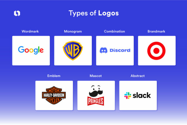
Within the two overarching categories, there are seven main types of logos, each with its own strengths and unique design characteristics.
“Logos operate on a sliding scale between the purely verbal and the purely visual: a word with a letter that makes a visual pun, or a symbol containing a company name,” –Michael Evamy, author of Logo: The Reference Guide to Symbols and Logotypes.
The 7 types of logos
Let’s get into the 7 types of logos and when and how to use each type. We’ll cover examples and some expert quotes to help you choose the right type for your brand identity.
1. Wordmark/logotype logo
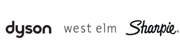
What is a wordmark logo?: The most classic and pure form of a logo is the wordmark, sometimes referred to as a logotype. And it’s simply the company’s name.
A wordmark hinges on the name of the company. Usually, companies with short names opt for a wordmark logo design (one-word or hyphenated/combination names are ideal). If a company name has two words, they can be stacked.
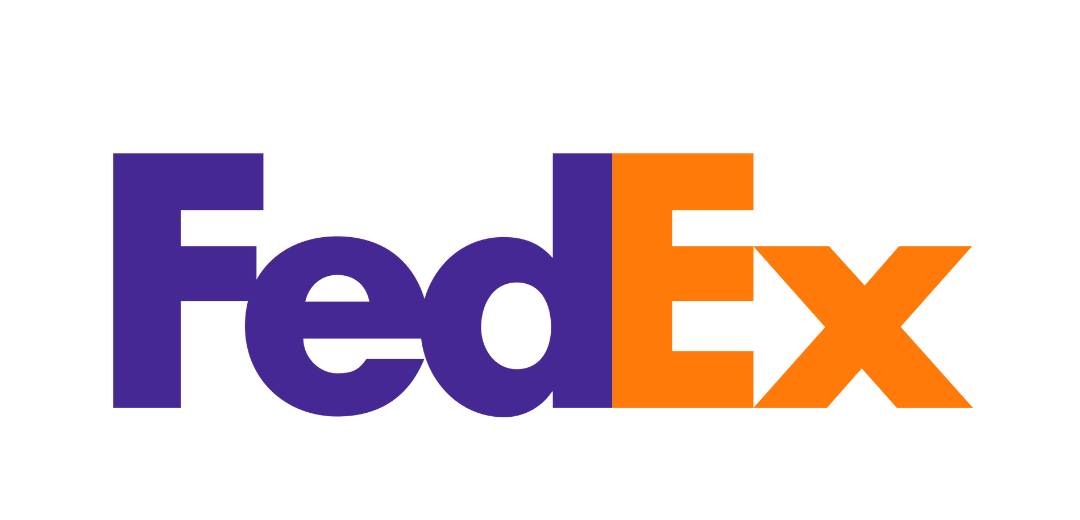
You can still get creative with your wordmark logo. For example, the FedEx logo above actually has a cool logo design between the “E” and the “x”. The arrow symbolizes movement! Font trends influence wordmark logos, so we’ve recently seen tons of sans serif and display fonts pop up.
73% of the logos of Fortune 500 companies use sans serif fonts. It’s a popular choice in today’s digital age!
Getting creative in your font choices is a branding trend we’ve seen throughout 2024. The style of the words elicits meaning and evokes the personality of the brand, whether that’s playful, artistic, educational, or serious.
Here are some wordmark logos made with the Looka logo maker:
Without symbols or illustrations, the stylized company name is the visual landmark of the brand. Think of famous examples like Google, Netflix, and The New York Times.
How and when to use wordmark logos
Choose a wordmark logo if these points ring true:
- Your company has a unique and concise name. This allows your name to stand out and be easily recognized.
- Building strong brand recognition through the name itself is your goal.
- You’ll invest in distinctive fonts and colors that reflect your brand identity.
- Design goals are uncomplicated and easy to reproduce across different media.
- Your marketing strategy emphasizes name recognition.
It’s common for companies to shorten their wordmark logo into an initial or monogram (think of Facebook, which uses its famous F in most of its applications). We’ll explain monogram logos next.
2. Monogram logo/lettermark logo
What is a monogram logo?: A monogram logo contains one to four letters, most commonly a company’s initials or first letter. If your company’s name isn’t short, you’ll want to explore a monogram (or lettermark) logo or logo variation.
It’s used instead of a traditional symbol, turning a company’s identity into an eye-catching visual.
Of course, the initials become the key part of the logo. In your design, they need to be legible but also memorable. If you’re a new kid on the block, consider putting the full company name under the logo to build recognition.
Here are some monogram logos made with the Looka logo maker:
How and when to use monogram logos
Lettermarks and monograms are more compact than logos that include an image, and they look good in containers, especially square logos. Consider a monogram for:
- A long business name to condense the name into simple, memorable initials.
- Professional and traditional aesthetic. Industries like law firms, financial services, or government agencies commonly use this style.
- New companies should be cautious when considering a monogram logo, This style requires a level of brand recognition to be meaningful.
- International companies benefit from a lettermark logo since it reduces language barriers.
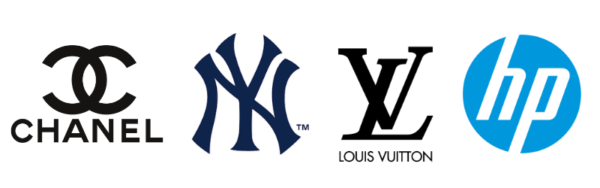
In the early stages of your company, you can always use your monogram in partnership with your company’s name. We see this with many fashion houses such as Chanel and Louis Vuitton above.
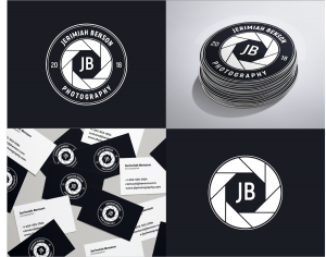
3. Combination logo
What is a combination logo?: A wordmark or lettermark with a symbol (often called a logomark) is what makes up a combination logo. It’s the most common type of logo design, in part due to its flexibility.
Based on a tally of the Fortune 500 logos, over 60% use a combination logo, or a wordmark and a symbol.
You can use the symbol on its own (e.g. in social media profile photos or favicons), or just the wordmark or lettermark when you need it. With combination mark logos, a symbol can appear beside, on top, below, or inside the text. It can even sometimes represent a letter in the company name.
This type of logo looks great on business cards! You can place the logo symbol on one side and the business name and your details on the other. Illustrations on business cards are a growing trend this year!!
The symbol is an identifying element of your brand, and it can be abstract or literal. Think of the iconic Nike swoosh and Apple logo—an smoothed checkmark that’s abstract and an apple that references the forbidden fruit.
How and when to use combination logos
Companies that are successful at developing a strong brand identity with a combination logo design might inevitably look to simplify their logo.:
Here are some tips to consider:
- Combination logos are a better choice for building brand recognition.
- A combination mark is an adaptable logo to use across mediums.
- Your brand’s values and services are better communicated with both text and imagery.
- A combination logo is good for generic brand names because the visual elements help distinguish your brand.
4. Abstract logo
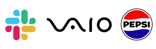
What is an abstract logo?: Abstract logos are logos that use symbols, fonts, or colors to represent a company or product without referring to anything literal. Examples of abstract logos include Slack’s crisscross logo and Pepsi’s “swirl” logo. They’re not referring to anything – these abstract symbols create an unmistakable distinction.
They can be used when a company wants to distinguish itself in the market and keep its identity open-ended and versatile. This way, customers can project their own meaning onto the brand.
How and when to use an abstract logo
Here are some tips on when to choose abstract logos for your design:
- If you want to convey emotions or values without being confined to a specific image. This creates a unique representation of your brand.
- When you want to establish a distinct, recognizable brand identity. These logos stand out in the market and offer creative freedom.
- You want a logo that scales well across different media. Abstract logos often have simple shapes that are easily recognizable in small sizes.
- You’re aiming for brand versatility. Abstract logos can evolve with the brand without losing recognition.
- The brand’s name is lengthy or complicated. An abstract, simple symbol can be more memorable and easier to recognize.
As Leonardo da Vinci said, “Simplicity is the ultimate sophistication.” And for abstract logos, we believe this rings true, keep simplicity top of mind if you decide to adopt this logotype for your brand.
5. Brandmark/logo symbol/pictorial mark logo
What is a brandmark logo?: A brandmark logo (AKA a logo symbol) is a standalone image or symbol. The mark can be pictorial, representing a real-life object (again, think Apple), or an abstract shape (like above).
These types of logos don’t include the company’s name, which is a big risk for a new business that wants its name to be visible.
Brandmark logos are best for brands that have already built up brand recognition. They’re also the only option for an app logo!
And just like time spent coming up with a company name, the type of image that’s employed in the brandmark logo needs to be heavily considered. Think of the following:
- What does the image say about your company?
- Is it a direct reflection of the company name or something more abstract?
- Does it convey an emotion or meaning to a potential customer?
How and when to use a brandmark logo
If you like the idea of a brandmark logo but aren’t sure it’s the right choice, consider these tips:
- Use a logo symbol when your brand is already well-established and recognized. These logos rely on brand familiarity!
- Consider a pictorial mark if your marketing strategy is global. Images can be understood universally.
- If your brand has a unique or particular story that can be encapsulated in an image.
- Implement a Pictorial mark if you want a logo that’s appealing and easy to remember. Images can be more memorable than words.
- Does it convey an emotion or meaning to a potential customer?
6. Emblem logo
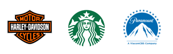
What is an emblem logo?: One of the oldest forms of a logo is the emblem. The elements of an emblem logo include vintage-style text inside of a container, (often a circle or other shape). Emblem logos can convey authority, seriousness, and stability.
Think of badges, seals, or crests. Emblem logos are treated as a cohesive image, rather than typography.
Fun Fact: If you’re wondering (like many of us have) what the Starbucks logo is? It’s a siren. Why a siren? Steve Murray, the Creative Director at Starbucks Global Creative Studio shared that the founders felt a siren “tied into what they felt Starbucks stood for.” And that’s because the company was founded in Seattle which is a port city, and coffee also often travels long distances, as does their coffee.
The emblem can communicate prestige or finesse—often associated with brands that have a long history. But these types of logos are also less versatile, especially for online usage. Emblem logos are usually intricate, so they can be trickier to shrink down for use on social media or business cards.
How and when to use emblem logos
Because of their shape, emblem logos make fabulous social media profile images. They also look great when printed on just about anything– from clothing to stickers because of their unique designs.
Opt for an emblem logo when you want to portray a sense of tradition or longevity. Consider this:
- Use an emblem if your brand name and logo design can be seamlessly integrated into one.
- Select an emblem logo if your business operates in a formal or traditional industry.
- Consider an emblem logo if you want your logo to tell a story. The emblem often provides space for symbolic elements, like the Starbucks siren.
- Be cautious with emblem logos. Like combination logos, it can lose details when scaled down.
- Avoid emblem logos if your branding strategy leans towards a modern approach. An emblem may look misaligned.
- Creating an emblem is costly! You’ll likely need a professional designer and lots of time.
7. Mascot logos

What is a mascot logo?: Mascot logos involve an illustrated character that acts as the ambassador of a brand. These types of logos are often fun and friendly and give audiences a persona to relate to and form a connection with.
You’ll often see mascot logos used in children’s brands due to their engaging nature. Think of the many Kellog’s characters, from Tony the Tiger to Tucan Sam.
Service companies, food brands, and sports teams are great users of these logotypes. But lately, we’ve seen a trend of more apps and tech brands taking on animated characters to humanize their brands.
How and when to use a mascot logo
Choose a mascot logo if you’re looking to inject a sense of life, and personality into your brand. Mascots can be great for telling stories, as well as animating. Consider this:
- Consider a mascot if you want a personable and approachable brand image. Mascots can make a brand seem more relatable and human.
- Use a mascot if you want a strong brand personality. Mascots can reflect the traits and values of your brand.
- Use mascots if your marketing involves storytelling or character-based narratives. Mascots can serve as the protagonist!
- Choose a mascot if you’re in a competitive market. The uniqueness and recognizability of a mascot can help your brand stand out. Think of Fido or Geiko!
- Avoid mascots if you want a professional image. Mascots can sometimes be perceived as less serious or professional.
Choosing the right types of logos
Remember: Your logo will live both digitally and physically. It will be scaled to different sizes, printed on paper, and uploaded as a profile picture — the list goes on. That’s why it’s so common for brands to create designs with and without a symbol (or monogram) to have both at the ready.
Here are some final notes on choosing the right types of logos!
- Logo usage across digital channels has gained popularity in the age of social media. So, Optimize for this!
- A longer company name may not work well in a small space, such as a square profile photo. Try a monogram instead!
- Having a logo that stands out helps you build recognition with your target audience.
- You can always re-brand and update your logo as you go. Your logo will evolve with your business!
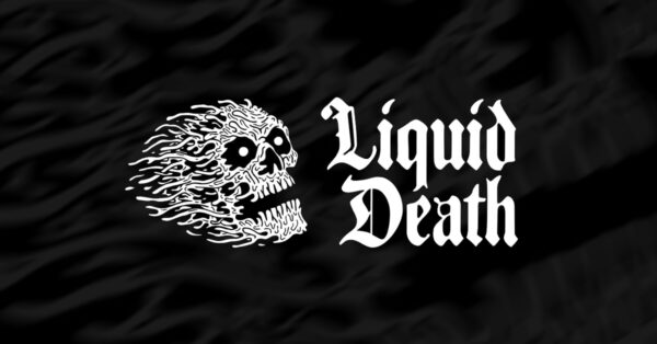
And remember, have fun with it! One of our favorite examples of getting creative with logo design is Liquid Death. They decided on a combination logo of a symbol and wordmark because well, they liked both! Believe it or not, this brand sells water. Canned water.
They put the average water bottle to shame, and made hydrating at a concert look cool.